I still remember the first click that felt like a handshake. When you design your website for an optimal user experience, a fast, clear site can calm a visitor and earn immediate trust. In a crowded search landscape—where only 40% of sites hit page one and just 23% rank in positions 1–3—every moment counts.
This guide will show how thoughtful design and solid interactions shape brand perception and drive results. We’ll cover hierarchy, navigation, speed, mobile readiness, accessibility, testing, and security. Each piece helps customers act with confidence and reduces bounce.
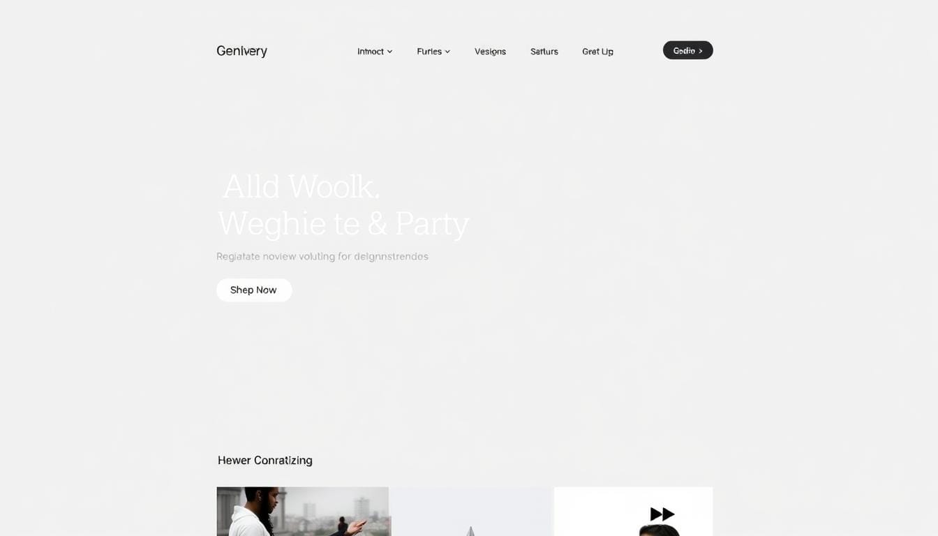
Place a clear hero statement and familiar patterns up front to help users orient and decide quickly. Prioritize speed, clarity, and consistent copy to build credibility fast. Treat experience as a measurable discipline tied to conversion, retention, and ranking.
Key Takeaways
- First impressions matter: clear hero areas cut friction.
- Speed and mobile readiness boost trust and conversions.
- Hierarchy and navigation guide customers to action.
- Consistency in copy and visuals improves brand credibility.
- Measure UX outcomes: conversions, retention, and rankings.
Why UX-First Website Design Is a Business Imperative in the United States Today
Users form an opinion within seconds, so the first view must state value and load instantly.
Visitors expect near-instant page responsiveness, a legible headline that states the offer, and a layout that renders on phones without pinching. These elements cut confusion and lower bounce.
What users expect on first load: speed, clarity, and mobile readiness
Slow load times erode trust. Even small delays raise bounce rates and hurt conversions.
- Near-instant feedback on taps and clicks reassures users.
- A clear headline and simple text show value fast.
- Mobile-ready layouts prevent horizontal scrolling and pinch zoom.
How UX impacts bounce rates, conversions, and search visibility
Intuitive elements like a sticky header, top navigation, and a visible search bar reduce friction and help discovery. Better usability boosts time on page and helps search ranking signals.
| Impact Area | What Signals | Quick Fixes |
|---|---|---|
| Bounce rates | Fast exits, short sessions | Compress images, simplify layout |
| Conversions | Click paths, cart abandonment | Clear CTAs, predictable menus |
| Search visibility | Mobile readiness, engagement | Responsive templates, on-page signals |
Businesses that standardize best practices see compounding gains: lower rates of abandonment, higher conversions, and stronger search presence.
User-Centric Best Practices: Put the Customer at the Center of Your Design Process
Start by defining what success looks like for customers and trace every step they take to reach it.
Map the customer journey and define needs, tasks, and outcomes
Begin with end goals. List what customers want to find, where they want to go, and what they want to buy.
Document the journey from first visit to conversion so the process turns into clear pages and flows that meet expectations.
Create personas and align cross-functional teams
Build personas using real demographics and behavior. Validate them with session recordings and analytics data.
Bring together design, SEO, content, product, sales, and CSM teams to keep voice, structure, and positioning coherent.
Use feedback loops: surveys, session recordings, and in-context feedback
Instrument the site with surveys and session recordings to capture why people act the way they do.
- Translate journey stages into content and product discovery paths.
- Prioritize fixes using impact on customers and measurable data.
- Keep an updated sitemap and redirects to protect journeys and avoid 404s.
Website Design for Optimal User Experience: Conventions, Trust, and Clear Communication
Follow familiar patterns so people can predict where elements live and act with confidence.
Place main navigation at the top or left and link the logo to the homepage. These small choices speed recognition and reduce hesitation. Use common icons like a shopping cart and account avatar to show product and account paths.
Use familiar layouts, recognizable icons, and predictable interactions
Keep layouts conventional within your industry so users know where to click. Add hover-state buttons and microinteractions to confirm actions without extra text.
Craft concise, accessible copy and consistent voice and tone
Write short text that states value and next steps. Avoid jargon in messages and use clear action labels like “Add to cart” or “Start trial.”
- Make similar elements behave the same across the site to build brand trust.
- Balance white space, images, and text blocks so key messages scan fast.
- Follow standard practices, then differentiate through copy quality and tone.
Hierarchy, Readability, and White Space: Make Information Effortless to Scan
Clear visual order helps people find what matters in seconds.
Use position, color, and size to guide attention. Place a bold headline, concise benefit list, and a single primary CTA where the eye lands first. Limit font choices—pick a clean face like Open Sans and keep sizes restrained so headings truly stand out.
Chunk text into short paragraphs and bullets. Short blocks speed comprehension and make pages easier to scan on phones and desktops.
Visual hierarchy: position, color, size to guide attention and actions
- Place main actions at top-left or center and use a contrasting color to draw focus.
- Scale headings so each level signals importance without crowding the page.
- Use consistent spacing around elements to group related information.
Typography, contrast, and chunking text for scannable pages
Maintain strong contrast and avoid hard-to-read combos. Keep body text readable at typical sizes and break long ideas into lists.
| Goal | What to change | Quick result |
|---|---|---|
| Draw attention | Primary color + larger CTA | Faster clicks on key actions |
| Improve readability | Limit fonts, increase contrast | Lower cognitive load, fewer rereads |
| Reduce clutter | Increase white space between blocks | Higher comprehension and faster decisions |
Use images sparingly to support headlines and product claims without slowing the site. Thoughtful spacing and clear hierarchy help users scan information across pages and act with confidence. These practices cut noise and make important messages stand out.
Navigation, Menus, and Search: Structure the Site Users Expect
A clear sitemap turns scattered content into a predictable map that teams can follow. Start by mapping pages, categories, and redirects so information stays organized when paths change.
Keep menus simple and consistent across templates. Use concise labels and predictable groupings so users learn the pattern and don’t have to relearn links on each page.
Key practices to reduce friction
- Use sticky headers and a visible search bar at the top to keep discovery fast.
- Add breadcrumbs so people can retrace steps without guesswork.
- Make internal links descriptive and place CTAs on deep pages to route actions toward conversions.
| Area | Why it matters | Quick fix | Result |
|---|---|---|---|
| Sitemap | Aligns teams and manages redirects | Document hierarchy, update redirects | Fewer broken paths, preserved journeys |
| Menus & headers | Guides exploration | Limit top-level items, add sticky header | Faster discovery, less friction |
| Search & breadcrumbs | Supports complex catalogs | Place search top-center, enable breadcrumbs | Quicker finds, easier backtracking |
Responsive Across Devices: Design and Test for Real-World Contexts

Prioritize clarity on phones so actions remain obvious when people scroll with one thumb.
Make mobile-first choices—shorten copy, enlarge CTAs, and keep menus simple so tasks finish quickly. Big tap targets and single-column layouts help people act with one hand.
Mobile-first layouts, tap-friendly CTAs, and simplified content
Start layouts on the smallest device and scale up. Use large buttons, clear labels, and trimmed text so each page reads fast on cellular networks.
Real device testing, browser coverage, and network condition simulations
Run cross-browser testing and try real devices to confirm gestures, fonts, and media behave the same. Simulate slow networks to validate load times and app-like interactions.
- Optimize images to preserve clarity while cutting bytes.
- Streamline page blocks so CTAs are reachable with a thumb.
- Ensure sticky headers and search scale across breakpoints.
| Check | Action | Result |
|---|---|---|
| Tap targets | Increase size to 44–48px | Fewer missed taps |
| Cross-browser | Test on major browsers and real devices | Consistent rendering |
| Network | Simulate 3G/slow LTE | Acceptable load and interaction |
Accessibility as a Non-Negotiable: Inclusive Design That Scales
When accessibility is non-negotiable, teams build clearer, more reliable paths to content and actions.
About 8% of men in the U.S.—over 26 million people—are colorblind. That makes relying on color alone risky. Use high contrast and multiple cues so critical information remains clear to everyone.
Practical checks to include in reviews
Set concrete accessibility goals and test them during design and development reviews. Reference WAI guidelines and automated tools to catch common issues early.
- Ensure color contrast meets standards and avoid conveying meaning by color only.
- Require descriptive alt text on images and clear labels so assistive tech can relay information.
- Support full keyboard navigation across menus, forms, and dialogs so those who cannot use a mouse can complete tasks.
- Run accessibility evaluation tools and manual audits to validate real-world use.
Inclusive practices widen reach and raise engagement. Accessible pages help more people find and act on information, lower support calls, and improve adoption across audiences.
Performance, SEO, and Security: Foundations of Credible UX

Technical hygiene—speed, search signals, and strong auth—builds lasting credibility.
Prioritize load speed by compressing images, enabling caching, and deploying a CDN so assets reach users fast. Keep layouts lean to avoid render-blocking and improve perceived performance across pages.
Apply on-page search fundamentals: clear headings, descriptive internal links, sitemaps, and alt text on images. These steps help crawlers and people find content and raise crawl efficiency.
Security and trust essentials
Use SSL, hardened hosting with firewalls and anti-malware, and limit login attempts. Enforce strong passwords and two-factor authentication to protect data and sessions.
Measure and fix with diagnostic tools and logging to surface bottlenecks that affect bounce rates and conversions.
- Compress and lazy-load images to cut bytes and speed render.
- Keep semantic markup and clean URLs to support accessibility and search.
- Follow compliance frameworks like GDPR/CCPA to reinforce trust with visitors.
| Area | Key Action | Immediate Result |
|---|---|---|
| Performance | CDN + caching + image compression | Lower load times, fewer bounces |
| Search | Headings, alt text, internal links, sitemap | Better indexation and discoverability |
| Security | SSL, hardened hosting, 2FA, logging | Stronger trust and reduced breaches |
Test, Iterate, and Personalize: Turn Data into Continuous UX Wins
Let measurable tests steer small, frequent improvements to pages and paths.
Validate changes in staging and keep testing after launch. Run A/B tests on CTAs and key flows. Use heatmaps and session replays to see where users interact and where they stop.
Collect in-context feedback to learn why people act the way they do. Combine that feedback with quantitative data to form clear hypotheses.
A/B tests, heatmaps, session replays, and benchmarking
- Establish a continuous testing cadence with A/B tests, heatmaps, and session replays to map where users interact along the journey.
- Benchmark against competitors on speed, clarity, and conversions to spot gaps and priorities.
- Use tools that capture both quantitative and qualitative signals so teams see clicks, scrolls, and spoken reasons behind behavior.
Collect feedback and refine content, CTAs, and flows
Translate findings into prioritized actions. Tweak copy, shorten forms, and reroute paths that cause drops.
| Action | Signal | Result |
|---|---|---|
| A/B testing | Lift in clicks or conversions | Proven change or rollback |
| Heatmaps & replays | Attention and friction spots | Targeted content and flow fixes |
| Feedback loops | Why users interact a certain way | Better messaging and page flows |
Document wins and losses as best practices. Make instrumentation part of every release so the process becomes learning, not luck.
Conclusion
Small, consistent improvements across pages compound into measurable business gains. Apply clear navigation, readable copy, and accessibility as core best practices. This raises user satisfaction, strengthens brand trust, and helps search signals over time.
Make iteration routine: measure key metrics, run tests, and gather feedback. Tie updates to business goals so changes drive real results. Keep the site simple, give elements ample space, and follow proven practices that aid users.
Prioritize performance, security, and inclusive design. When teams treat UX as ongoing work, the website becomes a reliable asset that earns loyalty and revenue. Review analytics, test often, and refine to keep the site aligned with user needs.


Leave a Reply